

Cover Design is a favorite hobby of mine. I say “hobby” because I only do it part time: I want to leave myself time for my own writing and family. Design allows me to explore a side of my creativity other than writing, which makes a refreshing change of pace after slogging through edits or messy first drafts.
Recently, I had the pleasure of designing a cover for Annie Douglass Lima. Since she is celebrating the release of her newest book, Heartsong, with a blog tour this week, I thought it would be fun to talk about the process of designing this cover for Annie.
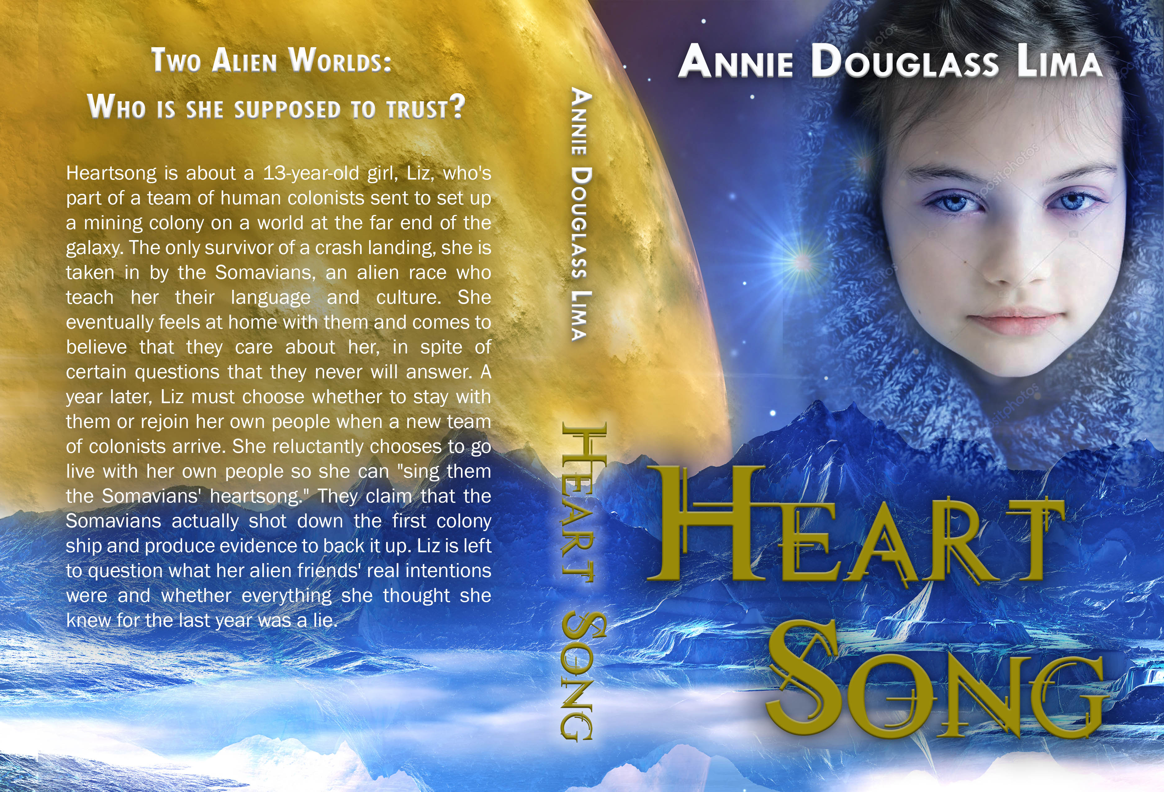
 Annie already had a beautiful image picked out that almost perfectly fit her story world. As soon as I saw it, I knew I was going to love this cover. She sent me a blurb about the story and a description of her main character, Liz, as well as a few idea about what she would like to see. Then the fun began.
I began searching for a pre-teen model who would fit her character description. This was, suprisingly, the most difficult part of this entire project. Either the girls looked to angsty, too pouty, or too SCARY (yes, I had to wade through scads of zombie photos). The first concept I sent Annie was with a little girl with a beautiful smile. The first fonts I chose ended up being the ones Annie liked best…which doesn’t often happen, so we were thrilled that it came together so quickly!
 And, yes, we loved the initial concept. But, although the coloring was compelling and the model adorable…the details just weren’t right. The moon was the wrong color and the model too young and too happy. She was also wearing a cute sweater, while the character Liz usually wore a sweatshirt. So we moved on to some other ideas.
After doing some research, we found a model with multiple poses that we kind of liked. The problem was, most of her poses were kind of angsty and creepy. We just didn’t get the vibe we wanted from her expressions. But I found a couple that Annie really liked and decided to give it a try.

Next comes the time-consuming task of photoshopping. It requires a lot of cropping, blending, merging, balancing colors and lighting…trying to make everything work perfectly.


We went through several versions of the moon until we finally came up with something desolate with just a hint of green and still visually appealing and balanced with the overall coverage. We also went through many versions of Liz, changing her size, her pose, the lighting…I even photoshopped a head on her because the pose we liked best had cropped off the top of her hoodie.
The last major adjustment we made to the cover…the color of Liz’s hoodie. In the book, it’s supposed to be a gray/green color that changes hues in the strange alien lighting. And our model is wearing a decidedly royal blue hoodie. So we tweaked the color of the sweatshirt to fit this final detail with the book.

And here we have it! The beautiful, final version of this amazing cover which is both beautiful AND accurate to the story. It was one of the most enjoyable covers I’ve done to date. I hope you enjoyed this little adventure into the realm of cover design.
So fun to see the process laid out here, after all our emails back and forth. Thank you again for putting in the time to find/make just the right Liz and put her on the perfect cover!
I am LOVING this book so far! Almost halfway in!